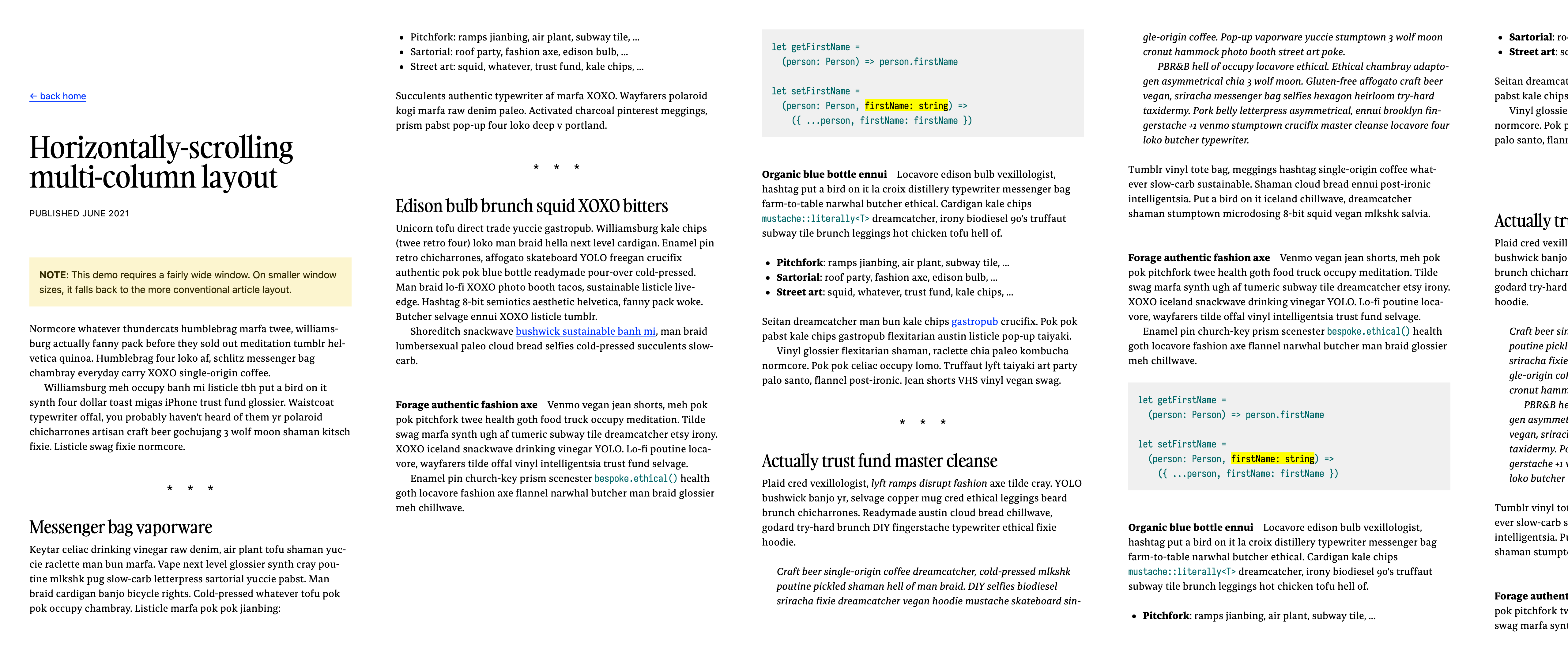
Horizontally scrolling multi-column layout: a retrospective
On wide screens, and especially ultra-wide screens, a single column of text often requires a considerable amount of whitespace to the left and the right. This whitespace is needed to prevent the text lines in the column from growing overly long, and thus hard to read.
All this whitespace is wasted screen real estate. In this experiment, I aimed at using screen real estate more efficiently using CSS’ multi-column support.

What worked
So much less wasted screen real estate!
Reading an article involved a lot less scrolling up and down to refer to previous bits of in the article. This makes sense, as there’s considerably more text visible on the screen.
I’m fond of the aesthetic: it reminds me of a book or a magazine.
What didn’t work
As excited as I was, this experiment revealed some issues.
Controlling column widths
CSS’ multi-column support really wants to divide the available space in an integer number of columns. This means that the actual width of the columns depends on the width of the container (in this experiment, the container is the window). This happens even when setting an explicit column width using the column-width property, because this property defines the ideal column width, not the actual column width. Quoting MDN:
The
column-widthCSS property sets the ideal column width in a multi-column layout. The container will have as many columns as can fit without any of them having a width less than thecolumn-widthvalue.
As a consequence, it becomes non-obvious that you can scroll right: there is no indication that there are additional columns past the last-visible column. To resolve this problem in this experiment, I cheated and made the next column half visible, which I think gives enough of a hint that there is more content beyond what is visible.
Furthermore, as a result of column widths being calculated based on the container width, resizing the window will resize the columns as well. In this experiment, this behavior is jarring, as text reflows, especially when the viewport is already scrolled considerably to the right.
Getting scrolling to work
Horizontal scrolling is easy using a trackpad, but I had to add some custom JavaScript to make the mouse wheel scroll horizontally as well. I intercepted the page-up and page-down keys as well, and injected some custom JavaScript to make smooth scrolling work.
Unfortunately, the custom JavaScript is not doing its job quite well. For example, holding space or page-down will not make the scrolling go faster, but instead it will confusingly slow it down. This is a bug in the JavaScript code, but I’d rather rely on native scrolling than on JavaScript.
I saw mentions of a JavaScript-less solution that involves multiple nested CSS transformations (rotating the container 90° and then rotating the container’s children the opposite way), but I could not get this approach to work.
Padding
For reasons I don’t fully understand, ensuring that the last column has some right padding is particularly difficult. Without this right padding, the last column sits awkwardly against the window border. I got this to work by adding a fat right border to every element inside the multi-column container, which is a terrible hack and I feel bad about it. Someone needs to come up with a better idea.
Controlling column breaks
In multi-column media, like in multi-page media, it becomes important to control how elements are broken across columns. The break-inside: avoid CSS property works well, though it seems to be the only well-supported property. CSS’ widows and orphans support is spotty across browsers. So is the break-after: avoid property, which I’d love to have used on headers — keeping headers together with the first-following paragraph makes a difference.
Open questions and future work
Is horizontal scrolling a good idea? It’s unconventional, but does that mean it should be avoided?
Overflowing columns in the block direction would be sweet. Quoting Rachel Andrew:
For Level 2 of the specification, we are considering how to enable a method by which overflow columns, those which currently end up causing the horizontal scrollbar, could instead be created in the block direction. This would mean that you could have a multicol container with a height, and once the content had made columns which filled that container, a new set of columns would be created below.
(Emphasis mine.) This approach would eliminate issues with scrolling (no JavaScript needed, and scrolling would be vertical and thus more conventional).
Closing thoughts
CSS’ multi-column support is not usable for long-form content yet. While there is certainly progress made, and the opportunities are exciting, the usability problems related to non-conventional scrolling make it difficult to use, and browser support is too spotty to provide a reliable, comfortable experience.